Candlestick Charts Versus Other Chart Types

ForexNewsNow – Besides offering a trading platform from which to enter trades, forex trading brokers generally incorporate charting software with their trading platforms. Generally, top forex brokers offer a charting feature on their trading platform that allows the trader to do technical analysis and in some cases, even trade directly off of the technical charts.
In addition, many forex trading brokers will offer educational articles and videos that assist their customers in learning about technical analysis. Price charts make up the foundation for technical analysis. Therefore, being familiar with the different types of price charts gives the novice forex trader a solid basis for learning technical analysis.
Different Types of Forex Price Charts
The three most popular types of forex price charts routinely used by traders consist of line charts, bar charts and candlestick charts.
- Line Charts – this type of price charts makes up the simplest and easiest to read, connecting each period’s closing rate in a line. The line will be drawn from left to right indicating the time period for the fluctuations in the currency pair’s rate. The line chart facilitates the identification of longer term trends and is often used by overlaying other technical indicators such as bands and oscillators.
- Bar Charts – the bar chart or OHLC chart gives the trader a more in-depth look at the rate’s fluctuations. OHLC represents the Open, High, Low and Closing prices that are indicated by small horizontal bars on a vertical bar. The vertical bar represents the range the currency pair had during the day. A small bar to the left will indicate the opening price while another small bar to the right indicates the closing price.
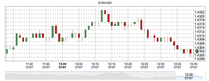
- Candlestick Charts – this kind of chart gives the trader the most information on a rate’s fluctuations in the least amount of space. Candlestick charts have several characteristics which give them an advantage over both the line chart and the bar chart.
Characteristics of Candlestick Charts
Candlestick charts get their name because of their visual similarity to candlesticks. A candlestick entry on a chart looks very much like a candle with a wick sticking out of either the top or the bottom, or both.
The candlestick will be either black — indicating a down trading period — or white — indicating an up trading period —. This will immediately convey whether the rate increased or decreased during the period in question.
Candlesticks consist of two parts:
- The Body – the body of a candlestick consists of the trading range between the opening price and the closing price. If the rate increased during the trading period, the body of the candlestick would be white. If the rate decreased, the body of the candlestick would be black. The opening price on a white candlestick is the lower edge of the body, while the closing price is the lower edge of the candlestick. On a black candlestick, the opening price is the top edge of the body, while the closing price is the bottom edge of the body.
- The Shadows – or wicks on the candle, the shadows show the trading range above or below the opening and closing prices. When the range exceeds the opening or closing prices, constituting the body of the candlestick, a line is drawn extending to the high and low of the period’s action from the body’s open and closing prices.
Advantages of Candlestick Charts
Candlestick charts have been in use for a long time, having a complete system of identification and interpretation developed by the Japanese. Candlesticks can be interpreted individually, as well as in groups of two and three.
A serious forex trader would do well in studying Japanese candlestick chart interpretation in addition to other technical analysis techniques. The combination of both systems gives the forex trader an edge in reading the market not attainable with a single technical interpretation system.
For more exclusive content, follow us on Twitter or join us on Facebook.


Comments (0 comment(s))